Varenne Typeface
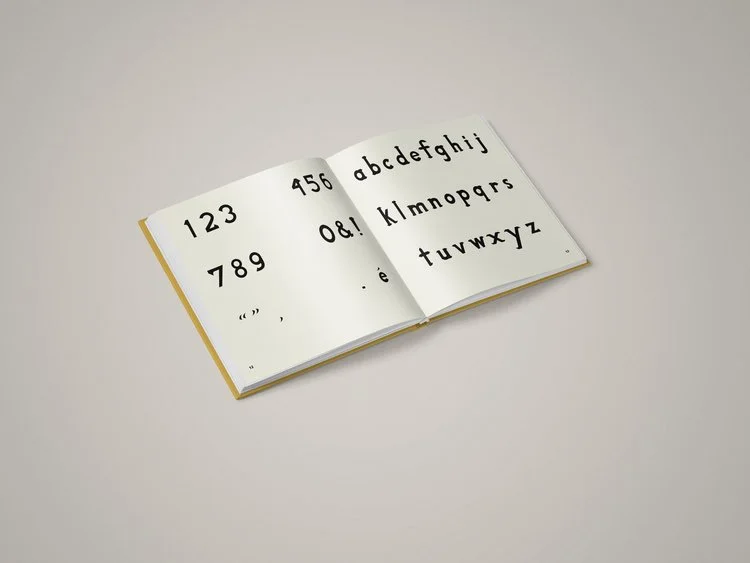
Varenne is an ideal typeface for cookbook covers and menu headers. It is easy for beginner chefs to read and enjoyable for seasoned food lovers.
I intended to create a typeface that encapsulates the elegance of French haute cuisine while maintaining the simplicity of the food. The serif ends at a sharp point to emulate the acute curvature of eating utensils, such as the dip of a spoon and the blade of a knife.
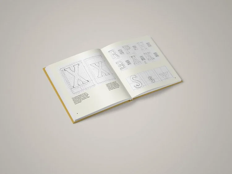
OPPORTUNITY: Create a typeface from scratch. The process involved researching starter faces, determining the x-height, sketching letters, finalizing hand-drawn characters, digitizing, and setting the face in the desired usage.
SOLUTION: I was fortunate enough to visit Paris, France, in March 2014. While at a bookshop, I purchased a copy of the esteemed "French Menu Cookbook." While pursuing the recipes one day, I noticed that the text on the cover was set in a very displeasing typeface.


